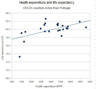
He suggests that Wilkinson and Pickett (W&P)* are correct in regarding the 'flat' part of the national income-inequality curve (the figure below) as being different from the rest of the curve, and thus W&P are justified in their very selective choice of which countries to include in their analysis:
Well presumably this is something to do with range restriction or small sample sizes as we discussed in part 1? Well maybe not because if we look at the relationship between health expenditure and life expectancy (the data for Portugal are estimated from another source but inclusion or exclusion makes no difference) there is a strong r=.56 statistically significant relationship. If we look at the relationship between Gini inequality and life expectancy when we control for health expenditure the correlation is a statistically significant r=.46, that is higher inequality is associated with greater life expectancy!
Now I'm not trying to argue here that inequality really leads to greater life expectancy, or specifically that inequality isn't related to life expectancy, or even that health expenditure is more important than income inequality for life expectancy, although all of these would be conclusions you could draw from the data I've presented. No, what I'm trying to point out is that the choice of both which specific source is used to derive the data and which countries to include or exclude when running these analyses has very important consequences for the relationships that are detected - and I am having trouble seeing what non-arbitrary criteria could be used to select the particular collection of countries used by W&P when it seems so very important to their claims that just this very specific sample are used.
* Is it just me that always thinks of this when they hear 'Wilkinson and Pickett'?
** I always exclude Luxembourg even though it is in the OECD because W&P pretty much exclude it from any analysis even though it's rich, and I think most people would agree with them given that it is a tiny (under half a million) country, and also the OECD don't have Gini or health expenditure data for it.
*** If this is upsetting you I also derived some 2007 data from another source for Israel and Singapore (from the UN Human Development report 2009) and the findings were the same with these two countries included. When I just looked at those countries used by W&P in their analyses (using OECD data plus the above data for Israel and Singapore) I also found no relationship between Gini and life expectancy (r=-.11, p=.61) which highlights just how important the exact combination of data source and subsample of countries is for W&P's claims. I haven't included UAE, Kuwait, Brunei, Qatar, Bahrain, Barbados, the Bahamas, or Cyprus in any analyses, just as W&P haven't, although they are richer than Portugal on that curve.


No comments:
Post a Comment