Ah, 'the most selfish generation' in demonstration yet again.Why should they pay enough money to provide their gold plated pensions, retiring at 60, when they can get the next generation to pay for their nice long life expectancies and take massive cuts in what they can expect when they're allowed to retire at 70+, if they even live that long.
"Dr Andrew Dearden, chair of the BMA’s pensions committee, said...the NHS Pension Scheme was running a surplus of around £1bn a year...How do you justify increasing contribution rates?’"
Saturday, 18 December 2010
BMA Idiots
From the GP magazine 'Pulse':
Monday, 22 November 2010
Levelling the spirit - pt 2.5
From the comments to part 2 Christopher Snowden notes that:
Well W&P may not do that, but I thought it was worth looking at. I obtained 2004 mortality data from the WHO. Obviously this data is confounded by the relative population structure so I took data for the over 60s since this is an at risk group for CVD and less likely to be confounded than the 15-59 age group. I'll just look at the countries W&P include in their analyses and use their measure of inequality. The measure of cardiovascular disease I'll use is ischaemic heart disease and cerebrovascular disease deaths (per 1000 over 60s) combined.
So what do we find? Well I've plotted the correlation below:

Not very convincing. That's a minimal correlation of r=.06 (not remotely statistically significant). If we just look at ischaemic heart disease (r=-.012) or cerebrovascular disease (r=.119) alone these are also small correlations and not statistically significant. I'm obviously still concerned about differences in the age structure in the over 60 populations between these countries but using other cause mortality as a covariate (which might pick up some of these population differences) doesn't make the relationship any stronger (doing a similar analysis using 15-59yr olds we find a correlation of r=.107 which is only marginally improved by using other cause mortality as a covariate, and which remains not even remotely statistically significant).
"...since the only plausible mechanism is through stress and CVD, what W & P really need to show is a correlation between inequality and CVD incidence. This, they never do."What he's saying is that as Wilkinson & Pickett (W&P) in the Spirit Delusion are claiming that income inequality influences health via the biological effects of psychological stress, and as the evidence from research on individuals suggests that any relationship between inequality or stress and health are likely to be through effects on cardiovascular disease (CVD), you would expect them to demonstrate that differences in inequality between countries are in fact associated with cardiovascular mortality specifically (rather than mortality overall).
Well W&P may not do that, but I thought it was worth looking at. I obtained 2004 mortality data from the WHO. Obviously this data is confounded by the relative population structure so I took data for the over 60s since this is an at risk group for CVD and less likely to be confounded than the 15-59 age group. I'll just look at the countries W&P include in their analyses and use their measure of inequality. The measure of cardiovascular disease I'll use is ischaemic heart disease and cerebrovascular disease deaths (per 1000 over 60s) combined.
So what do we find? Well I've plotted the correlation below:

Not very convincing. That's a minimal correlation of r=.06 (not remotely statistically significant). If we just look at ischaemic heart disease (r=-.012) or cerebrovascular disease (r=.119) alone these are also small correlations and not statistically significant. I'm obviously still concerned about differences in the age structure in the over 60 populations between these countries but using other cause mortality as a covariate (which might pick up some of these population differences) doesn't make the relationship any stronger (doing a similar analysis using 15-59yr olds we find a correlation of r=.107 which is only marginally improved by using other cause mortality as a covariate, and which remains not even remotely statistically significant).
Thursday, 21 October 2010
Levelling the spirit - pt 2
This is the second part of my discussion of Richard Wilkinson and Kate Pickett's The Spirit Level. In part 1 (and the updates parts 1.5 and 1.75) I covered their use of international comparison data and the limited consideration they give to potentially confounding factors such as material differences between high and low equality countries and their arbitrary and suspect looking decisions to exclude various countries or measures that upset their arguments.
I'll reiterate at this point that I'm all for reducing income inequality (as well as other forms of inequality), I think it is responsible for a number of pernicious and harmful effects in our society. However, I think the specific take on this problem by Wilkinson & Pickett (W&P) is both objectively unproven (and speculative) and potentially counterproductive.
Neo-materialism and income inequality
Cards on the table, I would probably favour more of a 'neo-materialist' explanation for the ill effects of inequality on society (and particularly on the poor), that is inequality largely has negative consequences through physical and material differences between the lives of the rich and poor. A nice summary of that position is given here:
Psychosocial effects on health
Although it is a little more vague and spread out in the book, in their interviews for the radio (e.g. Pickett on More or Less, or W&P on Analysis) W&P make it very clear that they are proposing a rather bold version of 'status anxiety' such that the stress of an unequal society directly causes ill effects via the physical consequences of stress hormones on health.
I should be upfront and say that this is far from biologically implausible, we know that chronic stress affects the hypothalamo-pituitary-adrenal axis and can therefore alter hormone levels, and we know high levels of the 'stress hormone' cortisol have been associated with increased cardiovascular (but not other) mortality**. But what is so appealing about the psychosocial hypothesis over the neo-materialist explanation for the relationship between income inequality, health, and other bad stuff?
In the Spirit Level W&P say:
Ah, the Whitehall II study - it all comes down to this. It is important for W&P to point towards studies like this because, for all their emphasis on comparing countries, because there are so many confounding factors comparing a few dozen heterogeneous countries, no one is going to believe that there is an association between inequality and health unless it can be shown at the individual level within a society.
Putting aside the rather poor history of associations between 'stress' and ill-health*, as W&P say, the finding that cardiovascular disease (CVD) showed an inverse association with job grade in the Whitehall studies was indeed a revolutionary moment in epidemiology. A huge number of publications have emerged from the Whitehall data and the central message has been, as W&P state in the book, that the relationship between job grade and CVD is mediated directly via job stress and control. These findings from the Whitehall II study form the core of the psychosocial explanation for the relationship between income inequality and health. Back in 2001 Wilkinson was saying:
As W&P say, the Whitehall II built on the findings of the Whitehall I study to show that employment grade and health outcomes, in particular coronary heart disease (CHD), are associated***. While risk factors such as smoking do account for a lot of this association it has been claimed that the strongest predictor of CHD incidence, even taking risk factors into account, is 'low control at work'. Job control is supposedly associated with CHD independent of job grade (and so presumably socioeconomic status), leading to the conclusion that low job grade is associated with heart disease because low job grade is associated with low job control - that is, it is the psychosocial strains of being in a low grade job that cause CHD. It would be difficult to overstate just how influential this conclusion from the Whitehall II data has been - although there have been other studies in other populations and looking at other psychosocial factors this is the core of the evidence for the role of psychosocial factors in causing disease.
So just what constitutes coronary heart disease?
The question I want to ask is how robust is this association between CHD and job control? There have been a number of studies looking at the Whitehall II data and job control (e.g. Bosma et al 1997, Kuper & Marmot 2003) and all have found the same thing - low job control is associated with higher incidence of CHD whatever job grade you are in.
But all is not quite as it seems - coronary heart disease (CHD) is quite a broad term, it covers a spectrum from fatal myocardial infarction (MI) to cardiac chest pain (angina), but all of these are the result of ischaemia in the heart. Most studies of the Whitehall II data have tended to lump all CHD together, combining MIs with angina to create the broad category of CHD. If we look at the findings from these studies we can see something very interesting, once we take into account confounding factors (like age or health related behaviours such as smoking) the association between CHD and job control is driven by angina rather than MI.
So in the paper by Kuper & Marmot they looked at two outcomes, all coronary heart disease and myocardial infarction (fatal or non-fatal). They actually found no effect of job control for women, but for men there was a highly significant effect of job control on all CHD even adjusted for coronary risk factors (smoking, cholesterol, hypertension, exercise, alcohol, BMI). However, there was no effect of job control on the rate of MI. And there wasn't even a relationship when the comparison was unadjusted for coronary risk factors. This is a puzzling result - if job control causes CHD then we would expect this to be reflected in all forms of CHD, in rates of MI just as much as angina since it is the same underlying biological process (furring up of the coronary vessels in the heart) that underlies both angina and MI.
If we look at the earlier study by Bosma et al we can begin to see why this anomaly might arise. In the same way as Kuper & Marmot they found an association between job control and all CHD - but they also split the data up into those with angina detected on a questionnaire (the Rose angina questionnaire) and those with CHD diagnosed by a doctor. What they found was that if you controlled for age, sex and coronary risk factors only questionnaire detected angina was associated with job control (with about twice the rate of angina in those with low job control versus those with high control) whereas in those with physician diagnosed CHD there was no statistically significant relationship (and around 1.3x the rate of diagnosed CHD in the low job control group).*4
Since the majority of patients classified as having CHD in the Whitehall II studies had Rose questionnaire diagnosed angina it is these patients driving the association between job control and CHD - those patients with harder end-points, actually having an MI or having a doctor diagnose them with CHD, didn't seem to show this relationship. So why might that be?
Diagnosis by questionnaire
The Rose angina questionnaire used in the Whitehall II study is a self reported measure of chest pain. All studies that have looked at the association between psychosocial factors and CHD in the Whitehall II data have classified anyone with a positive angina questionnaire as having angina and thus having CHD. The use of this questionnaire reminds me of a (possibly apocryphal) study I heard about where they gave healthy people a checklist of life threatening symptoms (chest pain etc) and asked them to keep a diary for a few days recording them - at the end of the study everyone had recorded 1 or 2 potentially life threatening symptoms per day.
The question is, does everyone with a positive Rose angina questionnaire have true angina and thus CHD? Now obviously a questionnaire that asks about chest pain is going to pick up people with angina (angina being, by definition, a form of self-reported chest pain that meets certain criteria) but it appears that some 70% of people diagnosed with CHD via the Rose questionnaire in the Whitehall II trial did not have a formal diagnosis of angina - that is they had not been diagnosed by a doctor with angina and did not have documented CHD through any other means. The risk here has to be that at least some of those 70% did not have angina at all - only about 12% of these people had an abnormal ECG, 5yrs later 80% still hadn't been diagnosed with CHD by a doctor, 15% didn't even report any further anginal symptoms, and 50% still didn't have any evidence of CHD other than via the Rose questionnaire.*5
So most studies have tended to find associations only between subjective reports of psychosocial factors (such as job control but similar problems are found in studies of other 'psychosocial' risk factors) and subjective measures of cardiovascular disease (the Rose questionnaire), rather than objective measures (like documented MI). We really have to entertain the possibility that people report more symptoms of chest pain when they feel less in control of their work (causality here may be direct, or via third factors like personality) without necessarily actually having increased rates of CHD - that is they report more chest pain for psychological reasons without necessarily having increased rates of dodgy coronary vessels in the heart. Without an effect on objective coronary endpoints we can only assume that an explanation of this form is most likely.
Just as we discussed in part 1, this criticism of the Whitehall II results is far from a novel observation, in 2005 epidemiologist George Davey Smith noted the results from one of his own studies using the Rose angina questionnaire:
To sum up part 2 - Wilkinson & Pickett rely very much on a psychosocial explanation of how inequality can impact on health and other aspects of quality of life without being mediated via material mechanism such as wealth or healh expenditure. While superficially plausible the basis for this explanation remains, at the very least, unproven. My concern is that if you purely emphasise the psychological impact of inequality then you are choosing to ignore or minimise (and in places W&P explicitly do this) material inequality and will encourage the rejection of more concrete concerns such as addressing smoking behaviour or increasing healthcare expenditure - things which will have a real impact on health and quality of life and which are probably going to be easier to provoke the necessary political will to address directly than tackling the hypothetical ill-effects suffered by people's perception of status inequality.
So what is my overall conclusion from reading the book? Well I said when I started out writing these two posts that I avoided reading the book for a long time because I both (a) sympathised with the authors aims and broad policy recommendations and (b) suspected that the actual data and methods used would make me cringe and then rant. I think I was proven right in my (b) but I also think that exposure to the arguments of W&P has undermined my belief in (a) - not that I now think inequality is good but rather that maybe I was wrong about sympathising with W&P's aims, because I wonder whether they are really quite so similar to mine after all.
As I concluded at the end of part 1, I don't think the Spirit Level deals with confounding factors at all adequately - and I think this it driven by a desire to undermine any causal role of material factors in explaning the relationship between inequality and health or other societal ills. This leads to W&P making what seem to be arbitrary and suspect looking decisions to exclude countries from their analyses or to use specific data sources rather than others precisely to undermine the relationships between material factors and these important outcomes.
They rely heavily on the unproven psychosocial hypothesis to provide a causal underpinning to the associations they describe despite this model being derived from a flawed interpretation of studies such as Whitehall II. I think that there is a real danger that the Spirit Level will lead people who genuinely recognise the social ills caused by inequality in society to neglecting real material changes that could be instituted in the here and now, and encourage politicians to ignore those changes because we all know that it isn't things like relative poverty or lack of access to healthcare that causes these societal problems, it is the psychological trauma of perceiving that you are lower status than someone else. In this regard I think that the Spirit Level may actually have a rather pernicious effect in undermining the very measures that we should be championing to address the inequality we see in our society today. This leads to my concern that perhaps I don't subscribe to (a) above because the authors aims and broad policy recommendations could actually conflict with those I would advocate from a neo-materialist perspective.
A worrying further point that I haven't discussed (largely because W&P simply do not provide much evidence to elaborate on it)*6 is that the Spirit Level, particularly in its media guise, has also set itself up for failure - W&P have framed the debate in such a way that they argue that inequality in society leads to worse outcomes for the whole of society, not just those at the bottom of the socioecenomic gradient. Now that may well be true for a number of social ills, but it may also not be for a number of other outcomes. By framing the debate as one of selfishness rather than altruism it provides a get out clause for those better off in society from supporting increased equality if they come to find that inequality is not always disadvantageous for them personally.
* The story of the discovery of the relationship between H. pylori and peptic ulcers is rather well know but it is a salutory lesson that spending too much time worrying about stress as a cause for disease can lead us to neglect rather stronger and more easily remedied physical causes.
** However there is actually only pretty equivocal evidence for an effect of the psychosocial environment on cortisol levels:
*** The latest data from the Whitehall II study show that, while those in the lowest employment grade compared to the highest group had 1.6x the death rate, once all health related behaviours (e.g. smoking) were controlled for, and crucially, taking into account how these behaviours varied over the course of the study, there was no statistically significant increase in the overall death rate in the lowest grade compared to the highest. However, overall there was a 1.85x rate of death from CVD in the lowest job grade, but no increased rate of non-CVD mortality. Therefore the main focus of those studying the relationship between inequality and health is on cardiovascular disease, and this has indeed been associated with levels of the 'stress hormone' cortisol as I noted above.
*4 The specific figures from these two studies are reproduced below with the more objective CHD outcomes in bold:
*6 For instance, they don't consider how things like murder rates differentially affect each end of the income distribution, assuming they're just a bad thing for society overall - which may be true but I'm pretty sure you'll find individuals doing rather well out of inequality.
I'll reiterate at this point that I'm all for reducing income inequality (as well as other forms of inequality), I think it is responsible for a number of pernicious and harmful effects in our society. However, I think the specific take on this problem by Wilkinson & Pickett (W&P) is both objectively unproven (and speculative) and potentially counterproductive.
Neo-materialism and income inequality
Cards on the table, I would probably favour more of a 'neo-materialist' explanation for the ill effects of inequality on society (and particularly on the poor), that is inequality largely has negative consequences through physical and material differences between the lives of the rich and poor. A nice summary of that position is given here:
The neo-material interpretation says that health inequalities result from the differential accumulation of exposures and experiences that have their sources in the material world. Under a neo-material interpretation, the effect of income inequality on health reflects a combination of negative exposures and lack of resources held by individuals, along with systematic underinvestment across a wide range of human, physical, health, and social infrastructure. An unequal income distribution is one result of historical, cultural, and political-economic processes. These processes influence the private resources available to individuals and shape the nature of public infrastructure—education, health services, transportation, environmental controls, availability of food, quality of housing, occupational health regulations—that form the “neo-material” matrix of contemporary life.This leads me to object to the core thesis of the Spirit Level - Wilkinson & Pickett go to great pains to claim that far from it being life's material inequalities that underlie the detrimental effects of income inequality in richer societies, it is in fact the psychological impact of this inequality that causes all the problems. Indeed they claim that material inequalities actually have no effect on health or other outcomes! We saw a little of this in part 1 where I discussed W&P's argument that expenditure on health in rich countries actually has no effect at all on life expectancy, infant mortality, or other commonly used measures of health outcome.
Psychosocial effects on health
Although it is a little more vague and spread out in the book, in their interviews for the radio (e.g. Pickett on More or Less, or W&P on Analysis) W&P make it very clear that they are proposing a rather bold version of 'status anxiety' such that the stress of an unequal society directly causes ill effects via the physical consequences of stress hormones on health.
I should be upfront and say that this is far from biologically implausible, we know that chronic stress affects the hypothalamo-pituitary-adrenal axis and can therefore alter hormone levels, and we know high levels of the 'stress hormone' cortisol have been associated with increased cardiovascular (but not other) mortality**. But what is so appealing about the psychosocial hypothesis over the neo-materialist explanation for the relationship between income inequality, health, and other bad stuff?
In the Spirit Level W&P say:
As societies have become richer...so the diseases we suffer from and the most important causes of health and illness have changed...During the greater part of the twentieth century, the predominant approach to improving the health of populations was through 'lifestyle choices' and 'risk factors' to prevent these chronic conditions. Smoking, high-fat diets, exercise and alcohol were the focus of attention.The Whitehall II Study
But in the later part of the twentieth century, researchers began to make some surprising discoveries about the determinants of health. They had started to believe that stress was a cause of chronic disease, particularly heart disease. Heart disease was then thought of as the executive's disease, caused by the excess stress experienced by businessmen in responsible positions. The Whitehall I Study, a long-term follow-up study of make civil servants...expected to find the highest risk of heart disease among men in the highest status jobs; instead, they found a strong inverse association between position in the civil service hierachy and death rates...Further studies...in Whitehall II, which included women, have shown that low job status is not only related to a higher risk of heart disease: it is also related to some cancers, chronic lung disease, gastrointestinal disease, depression, suicide, sickness absence from work, back pain and self-reported health.
So was it low status itself that was causing worse health, or could these relationships be explained by differences in lifestyle between civil servants in different grades?..these risk factors explained only one-third of their increased risk of death from heart disease. And of course factors such as absolute poverty and unemployment cannot explain the findings because everybody in these studies was in paid employment. Of all the factors that the Whitehall researchers have studied over the years, job stress and people's sense of control over their work seem to make the most difference.
Ah, the Whitehall II study - it all comes down to this. It is important for W&P to point towards studies like this because, for all their emphasis on comparing countries, because there are so many confounding factors comparing a few dozen heterogeneous countries, no one is going to believe that there is an association between inequality and health unless it can be shown at the individual level within a society.
Putting aside the rather poor history of associations between 'stress' and ill-health*, as W&P say, the finding that cardiovascular disease (CVD) showed an inverse association with job grade in the Whitehall studies was indeed a revolutionary moment in epidemiology. A huge number of publications have emerged from the Whitehall data and the central message has been, as W&P state in the book, that the relationship between job grade and CVD is mediated directly via job stress and control. These findings from the Whitehall II study form the core of the psychosocial explanation for the relationship between income inequality and health. Back in 2001 Wilkinson was saying:
The Whitehall II study showed that low control in the workplace predicted coronary heart disease independent of social status, and that low control in the workplace accounted for about half of the social gradient in cardiovascular diseaseNow the Whitehall II study is something I've covered before, but I think it is clear that my observations merit repetition in the context of the argument over the Spirit Level.
As W&P say, the Whitehall II built on the findings of the Whitehall I study to show that employment grade and health outcomes, in particular coronary heart disease (CHD), are associated***. While risk factors such as smoking do account for a lot of this association it has been claimed that the strongest predictor of CHD incidence, even taking risk factors into account, is 'low control at work'. Job control is supposedly associated with CHD independent of job grade (and so presumably socioeconomic status), leading to the conclusion that low job grade is associated with heart disease because low job grade is associated with low job control - that is, it is the psychosocial strains of being in a low grade job that cause CHD. It would be difficult to overstate just how influential this conclusion from the Whitehall II data has been - although there have been other studies in other populations and looking at other psychosocial factors this is the core of the evidence for the role of psychosocial factors in causing disease.
So just what constitutes coronary heart disease?
The question I want to ask is how robust is this association between CHD and job control? There have been a number of studies looking at the Whitehall II data and job control (e.g. Bosma et al 1997, Kuper & Marmot 2003) and all have found the same thing - low job control is associated with higher incidence of CHD whatever job grade you are in.
But all is not quite as it seems - coronary heart disease (CHD) is quite a broad term, it covers a spectrum from fatal myocardial infarction (MI) to cardiac chest pain (angina), but all of these are the result of ischaemia in the heart. Most studies of the Whitehall II data have tended to lump all CHD together, combining MIs with angina to create the broad category of CHD. If we look at the findings from these studies we can see something very interesting, once we take into account confounding factors (like age or health related behaviours such as smoking) the association between CHD and job control is driven by angina rather than MI.
So in the paper by Kuper & Marmot they looked at two outcomes, all coronary heart disease and myocardial infarction (fatal or non-fatal). They actually found no effect of job control for women, but for men there was a highly significant effect of job control on all CHD even adjusted for coronary risk factors (smoking, cholesterol, hypertension, exercise, alcohol, BMI). However, there was no effect of job control on the rate of MI. And there wasn't even a relationship when the comparison was unadjusted for coronary risk factors. This is a puzzling result - if job control causes CHD then we would expect this to be reflected in all forms of CHD, in rates of MI just as much as angina since it is the same underlying biological process (furring up of the coronary vessels in the heart) that underlies both angina and MI.
If we look at the earlier study by Bosma et al we can begin to see why this anomaly might arise. In the same way as Kuper & Marmot they found an association between job control and all CHD - but they also split the data up into those with angina detected on a questionnaire (the Rose angina questionnaire) and those with CHD diagnosed by a doctor. What they found was that if you controlled for age, sex and coronary risk factors only questionnaire detected angina was associated with job control (with about twice the rate of angina in those with low job control versus those with high control) whereas in those with physician diagnosed CHD there was no statistically significant relationship (and around 1.3x the rate of diagnosed CHD in the low job control group).*4
Since the majority of patients classified as having CHD in the Whitehall II studies had Rose questionnaire diagnosed angina it is these patients driving the association between job control and CHD - those patients with harder end-points, actually having an MI or having a doctor diagnose them with CHD, didn't seem to show this relationship. So why might that be?
Diagnosis by questionnaire
The Rose angina questionnaire used in the Whitehall II study is a self reported measure of chest pain. All studies that have looked at the association between psychosocial factors and CHD in the Whitehall II data have classified anyone with a positive angina questionnaire as having angina and thus having CHD. The use of this questionnaire reminds me of a (possibly apocryphal) study I heard about where they gave healthy people a checklist of life threatening symptoms (chest pain etc) and asked them to keep a diary for a few days recording them - at the end of the study everyone had recorded 1 or 2 potentially life threatening symptoms per day.
The question is, does everyone with a positive Rose angina questionnaire have true angina and thus CHD? Now obviously a questionnaire that asks about chest pain is going to pick up people with angina (angina being, by definition, a form of self-reported chest pain that meets certain criteria) but it appears that some 70% of people diagnosed with CHD via the Rose questionnaire in the Whitehall II trial did not have a formal diagnosis of angina - that is they had not been diagnosed by a doctor with angina and did not have documented CHD through any other means. The risk here has to be that at least some of those 70% did not have angina at all - only about 12% of these people had an abnormal ECG, 5yrs later 80% still hadn't been diagnosed with CHD by a doctor, 15% didn't even report any further anginal symptoms, and 50% still didn't have any evidence of CHD other than via the Rose questionnaire.*5
So most studies have tended to find associations only between subjective reports of psychosocial factors (such as job control but similar problems are found in studies of other 'psychosocial' risk factors) and subjective measures of cardiovascular disease (the Rose questionnaire), rather than objective measures (like documented MI). We really have to entertain the possibility that people report more symptoms of chest pain when they feel less in control of their work (causality here may be direct, or via third factors like personality) without necessarily actually having increased rates of CHD - that is they report more chest pain for psychological reasons without necessarily having increased rates of dodgy coronary vessels in the heart. Without an effect on objective coronary endpoints we can only assume that an explanation of this form is most likely.
Just as we discussed in part 1, this criticism of the Whitehall II results is far from a novel observation, in 2005 epidemiologist George Davey Smith noted the results from one of his own studies using the Rose angina questionnaire:
"The large apparent influence of stress on incident angina was probably seen because the people who reported high stress also reported other forms of discomfort in their lives, including chest pain. This was obviously not due to there being any actual stress-related coronary disease, otherwise it would have been revealed in incident ischaemia and cardiovascular disease mortality.A question of emphasis
...
We could have published the 2.5-fold increased risk of angina independent of confounders and reporting tendency, because studies of stress have got into major journals reporting on just this outcome with similar effect sizes...Rather than this, we reported these results as demonstrating how it is possible to get misleading findings on stress and disease from observational epidemiology. It is interesting to compare our results...with the Whitehall II study findings for job control...The two studies got very similar results with a subjective measure - Rose angina. In both studies there was no association between job control and the non-subjective measure of electrocardiogram (ECG) ischaemia. There is a remarkable parallelism between the findings."
To sum up part 2 - Wilkinson & Pickett rely very much on a psychosocial explanation of how inequality can impact on health and other aspects of quality of life without being mediated via material mechanism such as wealth or healh expenditure. While superficially plausible the basis for this explanation remains, at the very least, unproven. My concern is that if you purely emphasise the psychological impact of inequality then you are choosing to ignore or minimise (and in places W&P explicitly do this) material inequality and will encourage the rejection of more concrete concerns such as addressing smoking behaviour or increasing healthcare expenditure - things which will have a real impact on health and quality of life and which are probably going to be easier to provoke the necessary political will to address directly than tackling the hypothetical ill-effects suffered by people's perception of status inequality.
So what is my overall conclusion from reading the book? Well I said when I started out writing these two posts that I avoided reading the book for a long time because I both (a) sympathised with the authors aims and broad policy recommendations and (b) suspected that the actual data and methods used would make me cringe and then rant. I think I was proven right in my (b) but I also think that exposure to the arguments of W&P has undermined my belief in (a) - not that I now think inequality is good but rather that maybe I was wrong about sympathising with W&P's aims, because I wonder whether they are really quite so similar to mine after all.
As I concluded at the end of part 1, I don't think the Spirit Level deals with confounding factors at all adequately - and I think this it driven by a desire to undermine any causal role of material factors in explaning the relationship between inequality and health or other societal ills. This leads to W&P making what seem to be arbitrary and suspect looking decisions to exclude countries from their analyses or to use specific data sources rather than others precisely to undermine the relationships between material factors and these important outcomes.
They rely heavily on the unproven psychosocial hypothesis to provide a causal underpinning to the associations they describe despite this model being derived from a flawed interpretation of studies such as Whitehall II. I think that there is a real danger that the Spirit Level will lead people who genuinely recognise the social ills caused by inequality in society to neglecting real material changes that could be instituted in the here and now, and encourage politicians to ignore those changes because we all know that it isn't things like relative poverty or lack of access to healthcare that causes these societal problems, it is the psychological trauma of perceiving that you are lower status than someone else. In this regard I think that the Spirit Level may actually have a rather pernicious effect in undermining the very measures that we should be championing to address the inequality we see in our society today. This leads to my concern that perhaps I don't subscribe to (a) above because the authors aims and broad policy recommendations could actually conflict with those I would advocate from a neo-materialist perspective.
A worrying further point that I haven't discussed (largely because W&P simply do not provide much evidence to elaborate on it)*6 is that the Spirit Level, particularly in its media guise, has also set itself up for failure - W&P have framed the debate in such a way that they argue that inequality in society leads to worse outcomes for the whole of society, not just those at the bottom of the socioecenomic gradient. Now that may well be true for a number of social ills, but it may also not be for a number of other outcomes. By framing the debate as one of selfishness rather than altruism it provides a get out clause for those better off in society from supporting increased equality if they come to find that inequality is not always disadvantageous for them personally.
* The story of the discovery of the relationship between H. pylori and peptic ulcers is rather well know but it is a salutory lesson that spending too much time worrying about stress as a cause for disease can lead us to neglect rather stronger and more easily remedied physical causes.
** However there is actually only pretty equivocal evidence for an effect of the psychosocial environment on cortisol levels:
"In the 23 studies addressing association between cortisol in serum or urine and the psychosocial working environment, no consistent results were found: 11 showed no association, nine showed a positive association and three showed a negative association."
*** The latest data from the Whitehall II study show that, while those in the lowest employment grade compared to the highest group had 1.6x the death rate, once all health related behaviours (e.g. smoking) were controlled for, and crucially, taking into account how these behaviours varied over the course of the study, there was no statistically significant increase in the overall death rate in the lowest grade compared to the highest. However, overall there was a 1.85x rate of death from CVD in the lowest job grade, but no increased rate of non-CVD mortality. Therefore the main focus of those studying the relationship between inequality and health is on cardiovascular disease, and this has indeed been associated with levels of the 'stress hormone' cortisol as I noted above.
*4 The specific figures from these two studies are reproduced below with the more objective CHD outcomes in bold:
- In Bosma et al 1997 (from Table 6) odd ratio (OR) of new CHD at follow-up comparing low job control versus high job control: all CHD 1.93 (95% confidence interval 1.34-2.77) and adjusted for coronary risk factors (CRFs) 1.99 (1.36-2.91), angina 2.09 (1.29-3.37) and adjusted for CRFs 2.02 (1.22 to 3.34), diagnosed IHD 1.49 (0.81 to 2.74) and adjusted for CRFs 1.26 (0.67 to 2.39).
- In Kuper & Marmot 2003 (from Table 2) hazard ratio (HR) of new CHD at follow-up comparing low job control versus high job control (men only): all CHD 1.55 (1.26-1.90) and adjusted for CRFs 1.43 (1.15 to 1.78), fatal CHD and non-fatal MI combined 1.14 (0.82 to 1.59) and adjusted for CRFs 1.01 (0.70 to 1.45).
*6 For instance, they don't consider how things like murder rates differentially affect each end of the income distribution, assuming they're just a bad thing for society overall - which may be true but I'm pretty sure you'll find individuals doing rather well out of inequality.
Friday, 15 October 2010
Levelling the spirit - pt 1.75
Following on from part 1.5, here's my final set of analyses. I've had quite some trouble reproducing the analyses from the Spirit Level. This time I'm going to source my data from somewhere other than the OECD, the UN Human Development Report 2009 - this gives data for income inequality (average Gini 1992-2007), life expectancy at birth (2007), and government health expenditure (2006 in $PPP).
I've specified my data set in advance, I'm going to look at all countries (where data is available) shown on Wilkinson & Pickett's (W&P's) figure below which have greater national income than Porugal (the poorest country included in W&P's analyses). I'll also look at all those countries excluding those with a population less than 3 million (a specification made by W&P in their reply to critics). Finally I'll just look at those countries included by W&P in their analyses.

So, I'm throwing out Luxembourg, Liechtenstein, Hong Kong, and Andorra at the start because they aren't on the graph. This leaves me with 36 countries, all the usual ones plus Singapore, Korea, Israel, Slovenia, Brunei, Kuwait, Cyprus, Qatar, UAE, Czech Republic, Barbados, Bahrain, Hungary, and the Bahamas. Of these I have no Gini data on Iceland, Brunei, Kuwait, Cyprus, Qatar, UAE, Barbados, Bahrain, and the Bahamas. So I start with 27 countries - and the correlation between Gini coefficient and life expectancy is r=.13 (p>.5). The relationship between health expenditure and life expectancy was r=.37 (p=.06), so 'trend significant' as we say in the trade.*
Ok, population size, well the lack of data got rid of most of the small ones, but it's bye bye Slovenia with its 2m population, and unsuprisingly it makes little difference to the relastionship with life expectancy not significantly correlating with Gini (r=.12, p>.5) and the relationship with health expenditure even less significant than before (r=.35, p=.08).
Finally we'll look at W&P's subset of 23 countries: that means farewell to Hungary, the Czech Republic, and Korea, but we get to keep Singapore and Israel in addition to the usual crowd of Anglo-Saxon and Western European countries plus Japan. In this sample the correlation between life expectancy and Gini is still not significant at r=-.13 (p>.5) but now there is no correlation with health expenditure (r=0). Below I've reproduced the scatterplot of this relationship:

Compare this chart with the one by W&P in the Spirit Level reproduced below:
 The two graphs don't look massively different, yet W&P report that they found a statistically significant relationship between income inequality and life expectancy, whereas I didn't find much of a relationship at all. Why would this be? Well, as I've been discussing in the two previous posts the exact composition of countries in the subsample is important, but that can't be the issue here since we've used exactly the same arbitrary sample of countries as W&P. I've also discussed how data source is important, which is why I've sought to do my analyses using different sources to W&P to check how robust they are. But even then the two graphs look pretty similar, and life expectancy estimates are not likely to differ by enormous amounts between sources.** But one areas where my data in all my analyses differ from those of W&P is in how we estimated inequality. This is important because if you look at the two figures an important differences between them seems to be that Japan in the top left hand corner and the USA, Singapore, and Portugal in the bottom right hand corner seem more extreme in the scatterplot from W&P than they do in my graph.
So how did I estimate inequality? Well I just took Gini data from a UN report as a stated above. What is the Gini coefficient? I'll let W&P explain:
It seems that to both find no relationship between wealth or other markers such as health expenditure and life expectancy, whilst simultaneously finding a relationship between income inequality and life expectancy requires an exquisite balance between exactly which data source, subsample of countries, and measure of inequality you choose to use. Can it really be the case that W&P just stumbled onto this analysis first time and didn't think to check how robust it was to slight variations? Or could it be that there is some intellectual dishonesty at work?
* For 'trend significant' read 'not statistically significant'
** As Neuroskeptic points out in the comments there is a big difference between the life expectancy data in my graph and in the one from the book. Having downloaded the data from the Equality Trust website it seems that their data is about 3yrs older (from 2004) but from the same source. However, reanalysing the data using the Gini coefficients from this post and the life expectancy data from the book I get a stronger correlation (r=-.34) but this is still not statistically significant (p=.12). Re-analysing the data using their inequality measure confirms their analysis with r=-.44 (p<.05). So my failure to reproduce their analysis is partly about which year the life expectancy data is taken from and partly about the choice of inequality measure.
I've specified my data set in advance, I'm going to look at all countries (where data is available) shown on Wilkinson & Pickett's (W&P's) figure below which have greater national income than Porugal (the poorest country included in W&P's analyses). I'll also look at all those countries excluding those with a population less than 3 million (a specification made by W&P in their reply to critics). Finally I'll just look at those countries included by W&P in their analyses.
So, I'm throwing out Luxembourg, Liechtenstein, Hong Kong, and Andorra at the start because they aren't on the graph. This leaves me with 36 countries, all the usual ones plus Singapore, Korea, Israel, Slovenia, Brunei, Kuwait, Cyprus, Qatar, UAE, Czech Republic, Barbados, Bahrain, Hungary, and the Bahamas. Of these I have no Gini data on Iceland, Brunei, Kuwait, Cyprus, Qatar, UAE, Barbados, Bahrain, and the Bahamas. So I start with 27 countries - and the correlation between Gini coefficient and life expectancy is r=.13 (p>.5). The relationship between health expenditure and life expectancy was r=.37 (p=.06), so 'trend significant' as we say in the trade.*
Ok, population size, well the lack of data got rid of most of the small ones, but it's bye bye Slovenia with its 2m population, and unsuprisingly it makes little difference to the relastionship with life expectancy not significantly correlating with Gini (r=.12, p>.5) and the relationship with health expenditure even less significant than before (r=.35, p=.08).
Finally we'll look at W&P's subset of 23 countries: that means farewell to Hungary, the Czech Republic, and Korea, but we get to keep Singapore and Israel in addition to the usual crowd of Anglo-Saxon and Western European countries plus Japan. In this sample the correlation between life expectancy and Gini is still not significant at r=-.13 (p>.5) but now there is no correlation with health expenditure (r=0). Below I've reproduced the scatterplot of this relationship:

Compare this chart with the one by W&P in the Spirit Level reproduced below:
So how did I estimate inequality? Well I just took Gini data from a UN report as a stated above. What is the Gini coefficient? I'll let W&P explain:
"Other more sophisticated measures include one called the Gini coefficient. It measures inequality across the whole society rather than simply comparing the extremes. If all income went to one person (maximum inequality) and everyone else got nothing, the Gini coefficient would be equal to 1. If income was shared equally and everyone got exactly the same (perfect equality), the Gini would equal 0. The lower its value the more equal a society is. The most common values tend to be between 0.3 and 0.5."Sounds like quite a good measure of inequality then. So why didn't W&P use it in the Spirit Level? Well here they are to explain:
"To avoid being accused of picking and choosing our measure, our approach in this book has been to take measures provided by official agencies rather than calculating our own. We use the ratio of the income received by the top to the bottom 20% whenever we are comparing inequality in different countries: it is easy to understand and is one of the measures provided ready-made by the United Nations. When comparing inequality in US states, we use the Gini coefficient: it is the most common measure, it is favoured by economists and it is available from the US Census Bureau. In many academic research papers we and others have used two different inequality measures in order to show that the choice of measures rarely has a significant effect on results."Gosh, if only there was a way to obtain Gini data for the countries they studied. Never mind, since they've told us it doesn't make any difference I'm sure their selection of income ratios rather than the more commonly used and academically accepted Gini coefficient was just for convenience.
It seems that to both find no relationship between wealth or other markers such as health expenditure and life expectancy, whilst simultaneously finding a relationship between income inequality and life expectancy requires an exquisite balance between exactly which data source, subsample of countries, and measure of inequality you choose to use. Can it really be the case that W&P just stumbled onto this analysis first time and didn't think to check how robust it was to slight variations? Or could it be that there is some intellectual dishonesty at work?
* For 'trend significant' read 'not statistically significant'
** As Neuroskeptic points out in the comments there is a big difference between the life expectancy data in my graph and in the one from the book. Having downloaded the data from the Equality Trust website it seems that their data is about 3yrs older (from 2004) but from the same source. However, reanalysing the data using the Gini coefficients from this post and the life expectancy data from the book I get a stronger correlation (r=-.34) but this is still not statistically significant (p=.12). Re-analysing the data using their inequality measure confirms their analysis with r=-.44 (p<.05). So my failure to reproduce their analysis is partly about which year the life expectancy data is taken from and partly about the choice of inequality measure.
Thursday, 14 October 2010
Levelling the spirit - pt 1.5
Just a quick update to my previous post: Levelling the Spirit - pt 1 inspired by the discussion with Neuroskeptic in the comments.
He suggests that Wilkinson and Pickett (W&P)* are correct in regarding the 'flat' part of the national income-inequality curve (the figure below) as being different from the rest of the curve, and thus W&P are justified in their very selective choice of which countries to include in their analysis:
So I went back to my 2007 OECD data I've been using** and selected just those countries with greater (or equal) national income per capita than Portugal (the poorest country W&P use in their analysis). As you can see from the graph above I still get to keep Hungary, the Czech Republic and Korea, and I'm not including Israel or Singapore because they aren't OECD and that's where I get my data from***. So what is the relationship between inequality and life expectancy in this sample? Well, as you can see from the figure below, essentially there is no relationship (the correlation coefficient is tiny and is not statistically significant).

Well presumably this is something to do with range restriction or small sample sizes as we discussed in part 1? Well maybe not because if we look at the relationship between health expenditure and life expectancy (the data for Portugal are estimated from another source but inclusion or exclusion makes no difference) there is a strong r=.56 statistically significant relationship. If we look at the relationship between Gini inequality and life expectancy when we control for health expenditure the correlation is a statistically significant r=.46, that is higher inequality is associated with greater life expectancy!
 Now I'm not trying to argue here that inequality really leads to greater life expectancy, or specifically that inequality isn't related to life expectancy, or even that health expenditure is more important than income inequality for life expectancy, although all of these would be conclusions you could draw from the data I've presented. No, what I'm trying to point out is that the choice of both which specific source is used to derive the data and which countries to include or exclude when running these analyses has very important consequences for the relationships that are detected - and I am having trouble seeing what non-arbitrary criteria could be used to select the particular collection of countries used by W&P when it seems so very important to their claims that just this very specific sample are used.
* Is it just me that always thinks of this when they hear 'Wilkinson and Pickett'?
** I always exclude Luxembourg even though it is in the OECD because W&P pretty much exclude it from any analysis even though it's rich, and I think most people would agree with them given that it is a tiny (under half a million) country, and also the OECD don't have Gini or health expenditure data for it.
*** If this is upsetting you I also derived some 2007 data from another source for Israel and Singapore (from the UN Human Development report 2009) and the findings were the same with these two countries included. When I just looked at those countries used by W&P in their analyses (using OECD data plus the above data for Israel and Singapore) I also found no relationship between Gini and life expectancy (r=-.11, p=.61) which highlights just how important the exact combination of data source and subsample of countries is for W&P's claims. I haven't included UAE, Kuwait, Brunei, Qatar, Bahrain, Barbados, the Bahamas, or Cyprus in any analyses, just as W&P haven't, although they are richer than Portugal on that curve.
He suggests that Wilkinson and Pickett (W&P)* are correct in regarding the 'flat' part of the national income-inequality curve (the figure below) as being different from the rest of the curve, and thus W&P are justified in their very selective choice of which countries to include in their analysis:

Well presumably this is something to do with range restriction or small sample sizes as we discussed in part 1? Well maybe not because if we look at the relationship between health expenditure and life expectancy (the data for Portugal are estimated from another source but inclusion or exclusion makes no difference) there is a strong r=.56 statistically significant relationship. If we look at the relationship between Gini inequality and life expectancy when we control for health expenditure the correlation is a statistically significant r=.46, that is higher inequality is associated with greater life expectancy!

* Is it just me that always thinks of this when they hear 'Wilkinson and Pickett'?
** I always exclude Luxembourg even though it is in the OECD because W&P pretty much exclude it from any analysis even though it's rich, and I think most people would agree with them given that it is a tiny (under half a million) country, and also the OECD don't have Gini or health expenditure data for it.
*** If this is upsetting you I also derived some 2007 data from another source for Israel and Singapore (from the UN Human Development report 2009) and the findings were the same with these two countries included. When I just looked at those countries used by W&P in their analyses (using OECD data plus the above data for Israel and Singapore) I also found no relationship between Gini and life expectancy (r=-.11, p=.61) which highlights just how important the exact combination of data source and subsample of countries is for W&P's claims. I haven't included UAE, Kuwait, Brunei, Qatar, Bahrain, Barbados, the Bahamas, or Cyprus in any analyses, just as W&P haven't, although they are richer than Portugal on that curve.
Wednesday, 13 October 2010
Levelling the spirit - pt 1

I was right.
So in order to fulfil the 'rant' part of that reaction I'm going to share my thoughts on the evidence behind the Spirit Level in two parts trying not to associate myself with some of the attacks on the book from the right (but note that criticism hasn't come only from the right). I'll start with a discussion of the scatter plots that form the core of the book.
Bivariate scatter plots - playing dot-to-dot with the data
Now I'm just not a fan of 'ecological' analyses at the level of countries - even if you do multivariate analyses trying to control for confounding variables you're still taking a dozen heterogeneous societies and drawing straight lines through the data in a simplistic fashion. But in this book the authors, Richard Wilkinson and Kate Pickett, aren't even doing that, they're just plotting bivariate scattergrams, which doesn't bring the level of the analysis much above the level of a blog post (and I should know, I've written just such posts).
What the authors do is basically print a large number of scatter plots which show a relationship between 'inequality' (largely represented as income inequality) and something bad (e.g. murder rates, overall mortality, subway sandwich bars per capita, etc*) - they promise that the scientific literature shows that any potential confounding factors don't matter.
So just how robust are the correlations in the Spirit Level? Well lets look at one of them - the book makes considerable hay with the relationship between (income) inequality and worse life expectancy so that is what I will focus on (see Figure 1 below). It seems that the worse the income inequality in a country the lower the life expectancy.
| |
|
 |
| Figure 2: Income inequality versus life expectancy (OECD figures) |
So what is causing this relationship between income inequality and life expectancy? Wilkinson & Pickett would say that it is psychosocial factors (such as chronic stress caused by the status anxiety of an unequal society - more on this in part 2) but we can't really reach the conclusion that it is inequality per se causing the lower life expectancy without considering some alternative explanations - that is, we need to ask what other factors are correlated with both inequality and life expectancy that might actually causally mediate the relationship and show that they don't, in fact, do this.
Confounding variables - assessing alternative explanations
I've previously talked about the relationship between health expenditure and health outcomes including life expectancy (in these five posts here) and this would represent a good first proxy for those material factors that could underlie this relationship. Wilkinson & Pickett (W&P) say that health expenditure cannot be the causal factor, and produce this little graph to illustrate why (see Figure 3 below).
 |
| Figure 3: Health expenditure versus life expectancy (from the Spirit Level) |
In this scatterplot they find no relationship between the expenditure on health in these developed countries and life expectancy. Could this really be true? The US could reduce its expenditure from nearly $6000 per person down to the Portugese level of nearly $2000 and have no effect on life expectancy? That is quite a bold claim to be making with really very far reaching potential consequences if it is true.
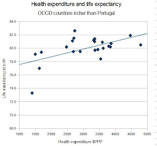
So let's sense check this data, we'll get our data from the OECD again, looking at total expenditure on healthcare in dollar purchasing power parity equivalents (see Figure 4 below).*4
 | |
| Figure 4: Health expenditure versus life expectancy (OECD figures) |
Well there are statistical methods to think about (although maybe not resolve) this question - a partial correlation looks to control for a third variable using regression analysis and then to then look at the relationship is between the two other variables assuming that third variable is the same across the sample. If we look at the relationship between Gini and life expectancy where we partial out the effect of health expenditure there is a correlation of .3 between Gini and life expectancy - that is, if we assume that expenditure is equal between all countries then increasing inequality actually predicts longer life expectancy (but this is not actually statistically significant).*5
Choosing your sample - or picking those cherries?
So why does the graph from the Spirit Level show no relationship between health expenditure when my scatterplot shows a strong relationship? Well we can see from the two charts that in the bottom left hand corner of mine there is a little bunch of countries that I have included and W&P have not - these include Hungary, Poland, the Czech Republic, Slovenia, Turkey and Mexico - I also don't have Singapore in my chart since it isn't in the OECD (while the others are).*6 So why aren't these countries in the Spirit Level? The book says:
"All the data come from the most reputable sources - from the World Bank, the World Health Organization, the United Nations and the Organization for Economic Cooperation and Development (OECD), and others."
Which isn't particularly enlightening. But in their 'response to critics' W&P say:
"In The Spirit Level analysis the authors took countries among the 50 richest in the world with populations of more than 3 million, for which there was comparable income distribution data. They did this because they wanted to look at the countries where life expectancy and other outcomes have ceased to be related to economic growth. Peter Saunders adds in Chile, Argentina, Mexico, Venezuela, Turkey, Trinidad & Tobago, Malaysia, Russia, Estonia, Lithuania, Latvia, Poland, S. Korea, Romania, Slovenia, Hungary, Croatia, Czech Republic, Slovakia. In Figure 1.1 (in The Spirit Level ) it can be seen that all these countries are on the rising part of the curve indicating that for them, unlike the richest countries, economic growth remains beneficial. Saunders' later demonstration that economic growth remains beneficial is entirely a result of including these poorer countries."
That figure they refer to is this one (Figure 5 below):
What they are arguing (and indeed argue in the book) is that for poorer countries there is a relationship between life expectancy and economic development - the richer the country the longer the life expectancy - but this relationship then disappears when you get to a certain threshold of wealth. We can see from their graph that there is certainly a steep portion of the scatterplot (below $10,000) and the region they want to concentrate on is the flatter part (above $25,000) but I think it is pretty misleading to claim that we can see no relationship between wealth and life expectancy once we move beyond the steep portion of the curve - certainly to my eye there is a less steep but still linear relationship between wealth and life expectancy in the region above $10-20,000.*7
| |
|
Even by W&P's standards if we look at countries by PPP adjusted GDP or by nominal GDP per capita they should have included countries like Hungary, the Czech Republic, Slovakia, Poland or Croatia which all come in the top 50 and have populations over 3 million. I took my data (without trying to decide on countries a priori) by just looking up what OECD data was available, and using that directly including where the numbers were indicated to be estimates (since we're interested in trends not exact numbers here). I'm somewhat concerned as to what exact grounds W&P have used to justify excluding those countries which fall at the bottom left of the scatterplot and thus will contribute most to the correlation between wealth (or health expenditure, or whatever measure of material difference we're using) and life expectancy.
At this point I think we need to talk about range restriction. If there is a correlation between two variables (say, for example, height and weight) then, despite the scatter (since not every heavy person is tall, and not every tall person is heavy, it is a relationship that holds on average) there will be a correlation and you can draw a nice regression line showing the relationship - but what happens if you just look at one part of the range (say only those above average in height)? well the relationship (as measured by the correlation) gets smaller, because the scatter noise now begins to mask the relationship. If you keep restricting the range eventually you'll end up with no relationship at all (say looking only at those in the top 10% of heights) even though we know that there is a relationship when we consider the whole range (have a look here for a visual example).
What this digression means is that you have to be careful about insisting on only looking at rich countries because you may not be showing that there is no relationship between expenditure and health in those countries, you may simply have restricted the range so much the relationship gets lost in the noise. And a good sense check for that is to see what happens when you add in a few countries at the bottom of the range - if there really is not relationship it shouldn't make much difference, and if it does you might want to think about just why you're excluding them - a point that is think is highly relevant if you're thinking about keeping in, say, Portugal (population 11m, nominal GDP per capita $22k) but excluding, say, the Czech Republic (population 10m, nominal GDP per capita $18k). Looking at W&P's argument above you also have to be very careful you don't begin some circular reasoning ("these countries are on the rising part of the curve...economic growth remains beneficial") where the very fact that a country has low health expenditure and low life expectancy, so that if it is included in the analysis there will be a relationship, it therefore must be excluded from the analysis - i.e. if there is a relationship we'll eliminate these countries until there is no longer a relationship! (see part 1.5 for further discussion of just how important the specific selection of countries by W&P is for their claims).
So, I think my take home message from part 1 is that the Spirit Level doesn't deal with potentially confounding factors in a satisfactory way, ignoring or dismissing material differences between high and low equality countries that could be the actual causal mechanism for the relationship between inequality and life expectancy (or other measures).*8 It also contains some fairly arbitrary and suspect looking decisions to exclude various countries that upset the arguments W&P are making.
Nothing new under the sun
It is probably worth noting that these shortcomings are not accidental - Wilkinson has been working in this field, and making these sorts of arguments, for many years and others have been questioning the assumptions he makes for just as long.
Take a look at some figures from literature published in the BMJ in 2000-2001 on this topic of wealth and inequality:
 |
| Figure 6: GNP per capita versus life expectancy (from Marmot & Wilkinson 2001) |
The figure shows the relation between life expectancy and gross national product per capita at purchasing power parities for the 25 richest countries for which the World Health Organization holds 1998 data. There is a slight negative relation between the two (r=−0.107). For the 30 richest countries, the correlation is 0.064. It is only when poorer countries are included that the association with mean income emerges.This article is in response to one which produces the figure below:
 |
| Figure 7: GDP per capita versus life expectancy (from Lynch et al 2000) |
Wilkinson's demonstration that absolute income was unrelated (r=0.08) to health among developed countries has been important in staking a claim for this psychosocial theory of health inequalities. Figures...show the association between gross domestic product per person and life expectancy...for the 33 countries where gross domestic product was greater than $10000—the cut-off used by Wilkinson. Our results, however, include data for all the countries above $10000, not a selection of some countries in the Organisation for Economic Cooperation and Development as used by Wilkinson. The correlation between life expectancy and gross domestic product per person in the complete sample is r=0.51 (P=0.003). Thus the association between absolute income and life expectancy among wealthier countries depends on which countries are included.
This is an argument that started a long time ago, the points being made now by the critics of W&P are not new, while I'm sure we're not going to resolve this debate any time soon it would be grossly misleading to pretend that these criticisms are purely politically motivated. Many researchers in this field were unimpressed when Wilkinson first made these arguments and those objections still stand largely unanswered.
I think that's enough for today - in part 2 we'll discuss the evidence for those psychosocial mechanisms W&P postulate to provide the causal connection between inequality and health (and various other 'bad things'). If yiou just can't wait until then 'Levelling the spirit - pt 1.5' should tide you over.
* I may have made up one or more of these examples.
** I'm going to use OECD data on OECD countries as my sample - the Spirit Level uses a lot of data from them and they largely represent what people would consider developed high income countries, I'm using 2007 which is the most complete set of data I have available. I've included all OECD countries I could get data for directly from the OECD so I don't include Chile because there was no Gini data or Luxembourg and Portugal because there was no health expenditure data, the US and Korea lack infant mortality data but are included in the life expectancy analysis.
*** All correlations are statistically significant at least to p<.05 unless I specifically note otherwise.
*4 This means that instead of adjusting expenditure between countries by the exchange rate between their currencies you look at what that expenditure would actually buy within the country concerned (so in a poor country your dollar is likely to go a lot further than in the US, and the purchasing power parity equivalent conversion reflects this). This seems to be the same thing that they do in the Spirit Level (see, I don't just make this stuff up).
*5 Note that if you partial out Gini from the relationship between expenditure and life expectancy you still see a partial correlation of .50 - more expenditure means longer life expectancy.
*6 This is a similar finding to that made in this person's blog post except, for some reason (perhaps selection of source for Gini coefficients) they don't find a significant relationship between Gini and life expectancy (whereas I do) but they do find the reversal of this relationship if you include covariates (in their analysis per capita GDP).
*7 An interesting comparison to W&P's claim that income (or expenditure) has no effect on life expectancy (or other health outcomes) can be found in the Spirit Level itself - in a figure from the book (Figure 8 below) W&P compare the relationship between the mortality rates in individual US counties and median household income in those counties:
 |
| Figure 8: Median household income by US county versus standardised mortality rate (from the Spirit Level) |
*8 Looking at infant mortality, another measure often used to estimate a country's level of health, we find that there is a correlation between the Gini coefficient and infant mortality of .77. Health expenditure correlates with infant mortality with a coefficient of -.64. However, unlike with the relationship between Gini and life expectancy, the partial correlation between Gini and infant mortality, controlling for health expenditure, the coefficient is attenuated to .62 - that is the relationship between income inequality and infant mortality is not likey to be mediated purely through the relationship between health spending and infant mortality - so it is more complicated than just claiming that the relationship between inequality and any health measure is simply mediated by health spending.
Friday, 17 September 2010
Catholic balls
From the Daily Mash:
POPE Benedict was congratulated on the sheer heft and girth of his testicles last night after the former Hitler Youth member said atheists were Nazis and accused Richard Dawkins of plotting a new holocaust.
Looking as if he believed every word of it, the Pontiff claimed it was the Nazis' atheism that drove them to kill millions and warned that the smart arse you argue with in the pub about religion will eventually gas you in a camp near Watford.
Thursday, 2 September 2010
Stephen Hawking rules modern art is rubbish after all
I love the idea that the world was basically waiting with baited breath for Stephen Hawking to make a ruling on the existence of God:
The Daily Mash:There is no place for God in theories on the creation of the Universe, Professor Stephen Hawking has said.He had previously argued belief in a creator was not incompatible with science but in a new book, he concludes the Big Bang was an inevitable consequence of the laws of physics.
"And - though it probably goes without saying - if the creation did not involve chocolate or monkey balloons, then who made your so-called 'physics'? Thrust and parry!"
Professor Hawking had previously argued that a 'grand unified theory of everything' could offer a glimpse inside the mind of chocolate but now accepts that such a discovery would finally make chocolate irrelevant, except for maybe Aeros and Wispas.
Friday, 13 August 2010
Depression severity
Interesting post on neuroskeptic about the HAMD:
"The APA use the terminology "Very Severe", which doesn't even appear on other scales...But where did the APA get their system from? This is the most extraordinary thing. Here's the paper they based their approach on. It's an 1982 British study by Kearns et al...You'll recognize the APA's categories, kind of, but they're all shifted. Why? We can only guess. Here's my guess. The scores in that Kearns et al graph were the average HAMD scores of people who fell into each severity band. The APA must have decided that they could use these to create cutoffs for severity."
Monday, 24 May 2010
Sunday, 9 May 2010
A thought for our new Tory overlords
I hope when the cuts fall they remember that those without much are least able to tolerate losing it, when you have lots there's plenty to cushion the blow. But I don't think that this is a message that they'll be receptive to.
Monday, 19 April 2010
Panorama and migration
Vaguely watching this dull Panorama, sensationalised and tabloid as all Parorama documentaries have become, about population pressures in the UK, concentrating, it will not surprise you, on blaming it all on immigrants: "there's a widespread belief that migrants get preferential access to housing...[insert glaring lack of any attempt to actually answer whether this is the case or not]"
But I was struck by the figure of immigration benefiting the UK by "only 60p per person per week" (contrast this with Migration Watch's previous figure of 4p) apparently sourced from this Lords report (although I can't find that specific figure), and contrasted with the 'misleading' government use of the benefit to GDP of immigration.:
The report makes an interesting point about how while in the short term migrants fill vacancies in he economy but in the long term the economy proportionately expands (increasing vacancies again). But in emphasising the raw monetary figure of per capita increase in GDP I think it is equally if not more misleading than the government approach. In particular I take issue with their rejection of the argument that a large proportion of the UK population are not of working age, whereas new immigrants are largely young or working age such that they swell the (shrinking) working age population which contributes (proportionately) the majority to the economy and state coffers - so that dividing immigrant contributions over the whole population is unfair because they are largely not addding to the dead wood of the non-working populace (who actually cause most of the costs to the state). The report says:
In this vein, if we're going to talk about how much immigrants add in 'per capita GDP' we have to compare them to other members of the population - old people or the unemployed for instance - what do they cost in per capita GDP? Averaging over a homogeneous UK 'indigenous' population is completely misleading because compared to significant proportions of the UK population immigrants use much lower poroportions of national expenditure. The question should be how many 'indigenous' people does each immigrant support? And 'per capita GDP' can't answer this.
To look at it another way, if we consider a British person who contributes exactly the average per capita GDP to the country, are they having zero effect on the country or a net benefit? According to the 'per capita GDP' measure of economic contribution they are giving nothing to the country - despite working, paying taxes etc. - whereas common sense shows that they are helping to pay for those people who are a net cost to GDP (the economically inactive like the old, the young, the sick, the unemployed).
* Another gift from 'The Most Selfish Generation'
But I was struck by the figure of immigration benefiting the UK by "only 60p per person per week" (contrast this with Migration Watch's previous figure of 4p) apparently sourced from this Lords report (although I can't find that specific figure), and contrasted with the 'misleading' government use of the benefit to GDP of immigration.:
The total size of an economy is not an index of prosperity. The focus of analysis should rather be on the effects of immigration on income per head of the resident population.
The report makes an interesting point about how while in the short term migrants fill vacancies in he economy but in the long term the economy proportionately expands (increasing vacancies again). But in emphasising the raw monetary figure of per capita increase in GDP I think it is equally if not more misleading than the government approach. In particular I take issue with their rejection of the argument that a large proportion of the UK population are not of working age, whereas new immigrants are largely young or working age such that they swell the (shrinking) working age population which contributes (proportionately) the majority to the economy and state coffers - so that dividing immigrant contributions over the whole population is unfair because they are largely not addding to the dead wood of the non-working populace (who actually cause most of the costs to the state). The report says:
Arguments in favour of high immigration to defuse the “pensions time bomb” do not stand up to scrutiny as they are based on the unreasonable assumption of a static retirement age as people live longer and ignore the fact that, in time, immigrants too will grow old and draw pensions. Increasing the retirement age, as the Government has done, is the only viable approach to resolving this issue...
Lord Turner argued that as people live longer, it is reasonable to assume that the extra years of life are divided between working years and retirement so as to keep roughly stable the proportions of life spent working and retired. Under this assumption, half of the projected increase in the dependency ratio disappears, when compared with the simplistic case in which the retirement age stays unchanged.First of all I'd like to make clear that it is generally considered that for every additional year of life expectancy you can expect at best 6 months of relative health and 6 months of ill-health such that the policy of incrementally increasing the retirement age with life expectancy is basically aiming to work the populace until they are sick and to erode the few years of healthy retirement they might otherwise have expected*. It is also worth noting that immigrants can have a tendency to return to their country of origin after a few years. So while it is true that increasing the working age population will increase the number of retired people eventually (although to a lesser extent in the first generation due to decreased life expectancy compared to the UK population as a whole) it is still more sustainable in the short term than increasing the retirement age until people are being worked right to their death beds (in order to pay for the current older generation's nice early retirements at 60-65yrs old with over 10 yrs of life expectancy).
In this vein, if we're going to talk about how much immigrants add in 'per capita GDP' we have to compare them to other members of the population - old people or the unemployed for instance - what do they cost in per capita GDP? Averaging over a homogeneous UK 'indigenous' population is completely misleading because compared to significant proportions of the UK population immigrants use much lower poroportions of national expenditure. The question should be how many 'indigenous' people does each immigrant support? And 'per capita GDP' can't answer this.
To look at it another way, if we consider a British person who contributes exactly the average per capita GDP to the country, are they having zero effect on the country or a net benefit? According to the 'per capita GDP' measure of economic contribution they are giving nothing to the country - despite working, paying taxes etc. - whereas common sense shows that they are helping to pay for those people who are a net cost to GDP (the economically inactive like the old, the young, the sick, the unemployed).
* Another gift from 'The Most Selfish Generation'
Tuesday, 13 April 2010
BBC distorting the news
This story was widely reported in the news today:
So today's health news was dominated by essentially an advert for a BBC documentary. Maybe there was something worth saying but the media really need to be more transparent about what is driving the news agenda.
Preventable diseases in children are reaching epidemic proportions that could see a generation dying before their parents, doctors at a leading children's hospital have warned.But this story is obviously related to this BBC documentary:
With unprecedented access to Alder Hey Children's Hospital in Liverpool, Panorama meets the kids and the paediatricians treating them, and follows them home in an attempt to uncover the root cause of their problems. Reporter Richard Bilton soon discovers that some of the basic health messages from the doctors are not getting through to the parents.So either Alder Hey have been sending out press releases to coincide with BBC documentaries or the BBC have done so themselves, either way it is a real distortion of the news agenda for the day to present this story without pointing out the BBC's role - unfortunately this seems to be more and more common. A particularly stark example can be seen when the Today programme interview someone then the news bulletin seconds later reports a throwaway comment (often the result of bizarre questions and extensive badgering all designed to get a specific response) as if it is some groundbreaking announcement (normally quoting it out of context).
So today's health news was dominated by essentially an advert for a BBC documentary. Maybe there was something worth saying but the media really need to be more transparent about what is driving the news agenda.
Monday, 5 April 2010
Gotta persecute me some Christians
Amusingly partisan documentary on the 'persecution' of Christians. Damn those 'New Atheists', still at it. Of course I have some form, after all, 'ultimately you are either for or against baby Jesus', oh why do I hate the baby Jesus so?
"It is true that a number of muslims have failed to win the right to wear the full veil at work, but even so..."
Tuesday, 30 March 2010
Serotonin hypothesis of depression
A post from The Twenty-First Floor on the serotonin hypothesis of depression:
The main aetiological explanation for depression in the public consciousness is undoubtedly the “serotonin hypothesis”. This probably manifests more popularly as the idea that depression is somehow the result of a “chemical imbalance” in the brain, and therefore that sufferers of depression (whose suffering is not in question) are somehow the passive victims of an organic condition, like victims of diabetes, for example, and that this can be righted with medication. It’s a neat explanation, which, I guess, is why it’s so appealing. However, the evidence, as it so often does, suggests that depression is nowhere near this simple.While I agree that the evidence for the serotonin hypothesis of depression (or even the rather wider monoamine hypothesis) is fairly weak, he links to this study finding mixed evidence for an association between suicide, impulsivity, and depression and serotonin metabolite levels. It is worth noting that a review by Mann et al (1989) is often taken as demonstrating that serotonin (or its metabolites) are reduced in the brainstem (source of serotonergic projections in the brain) in suicides, independent of underlying diagnosis. Although this actually only shows reduced serotonin in depressed suicides (if you look at the individual studies) that would actually make it stronger evidence for the hypothesis.
Friday, 26 March 2010
Treating depression in general medical patients
As a doctor with an interest in psychiatry currently working in general medicine the issue of depression in general medical patients is one that interests me. We commonly see overdoses secondary to depressive illness and depression in patients with terminal diagnoses but also in many other conditions, particularly chronic disease. While we have access to specialist psychiatric or palliative care services for the former conditions that still leaves a substantial number of depressed patients to care for, and that is something of a treatment dilemma.
Physical illness is strongly associated with depression and some 10-20% of general medical inpatients or outpatients have a depressive disorder. This is particularly marked for people with chronic disease where rates range from 11% of diabetics to 20% of people after a heart attack. Depression is a a risk factor for poor prognosis in physical disease, being associated with worse mortality, at least partly mediated via decreased adherence to treatment. Yet evidence shows that physically ill patients receive less antidepressant prescriptions than other depressed patients.
There are some specific challenges in recognising and treating depression in general medicine, early in an admission somatic symptoms of depression can difficult to distinguish from symptoms of physical illness and later on during treatment low mood can be considered 'understandable', with a natural resistance on the part of clinicians to medicalise normal emotional reactions. The inpatient environment is also unusual and stressful and it is unclear whether patients will maintain a low mood or improve when discharged home. Practically, the onset of antidepressants is generally believed to be delayed over two weeks which means that any effect may not be seen during an acute admission and psychological therapies such as CBT are just not available in general medicine.
In recent years the risks of self-harm and discontinuation syndromes with antidepressants have received significant coverage and since Irving Kirsch's 2008 paper much doubt has been raised about overall antidepressant efficacy in any other than the most severe patients. A recent Cochrane Review has addressed the question of antidepressant usage for depression in physically ill patients:
They looked at studies of depression quite broadly defined (major depressive disorder, adjustment disorder, dysthymia) and found 51 studies (mostly in SSRIs but also in tricyclics and a few less common antidepressants), with fluoxetine (Prozac) the drug most commonly studied (12 trials). The physical diseases studied included stroke (11 studies), HIV (7), Parkinson's disease (6), cancer (4), COPD (chronic bronchitis and emphysema; 3), diabetes (3) , heart attacks (2), and renal failure (2). At the two follow-up periods of most interest (6-8 wks and 9-18 wks) there were around 1,000-1,500 subjects included in the analysis.
 Overall they found that antidepressants were similarly effective at all follow-up durations (ranging from 4 to greater than 18 weeks) as seen in the summary figures on the right. We can see an odds ratio of around 2, that is antidepressants roughly double the chance of a 50% improvement in outcome score (most studies used the Hamilton Rating Scale for Depression) or showed a standardised mean difference of around 0.5*

Looking at other aspects they found that there were more people dropped out of the study from the antidepressant group than the placebo group (this was marginally significant) with an odds-ratio of 1.3 (95% confidence interval 1.0-1.8). Looking at side-effects, dry mouth and sexual dysfunction were both significantly more likely to be reported by those in the antidepressant group, the latter being primarily driven by those taking SSRIs. So overall antidepressants had side-effects sufficiently bad to lead more people to drop out of the study.
The study didn't find any striking differences between the efficacy of SSRIs and other antidepressants, nor differences between taking a narrow (major depressive disorder only) or broad definition of depression.
Looking at the I-squared statistic for trial hetrogeneity we can see that for dichotomous outcomes differences between trials were not very large but for the mean difference outcomes there was very large heterogeneity. However, this seems to be due to two studies with stonkingly big effect sizes (improvements greater than 10 points on the HRSD) and excluding these from analyses drops the I-squared right down without massively affecting the results.
Overall this is quite an interesting finding and it suggests that antidepressants can be really very effective for depression in physically ill patients. But there are some limitations to bear in mind:
 Looking at a funnel plot from the study we can see apparent publication bias (see right), the gap at the bottom left of the pyramid represents missing small trials (or rather, trials with a large standard error) with a large negative effect of antidepressants. This suggests that some negative trials (which we would have predicted would exist based on the effect size we are finding) are missing from the literature included in the review. This is an example of how small positive trials are much more likely to get published than small negative trials which disappear into the file drawer. Publication bias is a known problem in antidepressant trials. When Turner et al analysed data submitted to the FDA before approval** they found that 37/38 positive trials were published but only 14/36 negative trials were published, and 11 of these actually claimed a positive result!
Trial quality was disturbingly low, the authors used the 'Risk of Bias' table from the Cochrane Handbook to score as 'low risk', 'unclear risk', or 'high risk' of bias on six items:
 Only three studies scored as 'low risk' of bias on four or more items*** and only something like 13 on three or more items. The authors find that by looking only at these 13 odd studies the effect size is not grossly different to looking at all the studies. If we just look at the three best quality studies (see right, data from 9-18wks) there is a large effect that is not statistically significant for the mean difference in HRSD scores (but it is significant looking at SMD) that suggests that it isn't purely low quality trials driving the beneficial effect of antidepressants seen in this study.
 Not looking at the effect of baseline severity in the wake of Kirsch et al and its widespread impact is curious. Kirsch et al, looking at the same FDA data as Turner et al, found that the NICE threshold for 'clinical significance' (an improvement of 3 points on the HRSD or 0.5 SMD) was reached around a baseline severity (as measured by the HRSD) of 26 points, which is classified as 'very severe' by NICE and the American Psychiatric Association (see right). Similar results were found by Fournier et al looking at individual subject level data.
 I made a back of the envelope attempt to plot the meta-analysis data against baseline severity**** and we find that the NICE threshold is actually reached at quite low baseline severity (18.5-21.5) which falls in the upper range of moderate through to severe severity.
 In summary, studies of antidepressant use in physical illness indicate a large effect size that is 'clinically significant' in the 'severe' depression range, and there is a disparity between the large effects sizes in this review and in other studies of depression. Although I have some criticisms of Kirsch et al it seems most likely that this disparity is due to publication bias in the Cochrane meta-analysis. There are some interesting issues regarding the way that studies in general depression usually have a more severe major depression population and any extrapolation to less severe patients is on the basis of few studies whereas the Cochrane review includes a number of less severe conditions and it is possible that this makes it therefore more sensitive to beneficial effects at the lesser degrees of severity. It is also possible that physically ill patients may be more responsive to antidepressants but I'm unconvinced.
This study looked at largely outpatient populations with chronic illness and it isn't clear whether the results are directly applicable to inpatient populations but it certainly supports the use of antidepressants in inpatient depression and suggests that at the very least they are likely to be as effective in this population as in the general population of depressed patients.
Finally it is worth noting that NICE has a guideline on treating depression in chronic physical illness which makes recommendations which are broadly similar to those they make for depression in general:
* Standardised mean difference is the difference between the mean outcome scores for the antidepressant and placebo groups divided by the standard deviation, this corresponds to something like a difference of 4 points on the HRSD. Since many studies don't report dichotomous 'improvement' measures, or use different definitions, and these have to be 'imputed' using the mean difference data (making assumptions about how the data is distributed), I prefer mean difference data, ideally using the raw HRSD figures rather than the standardised mean difference (since this can create odd distortions in the data, e.g. in Kirsch et al's study). Almost all studies use the original 17-item HRSD but the few studies that instead use, say, the Montgomery-Åsberg Depression Rating Scale means that the authors have used the SMD so that this data can be combined (the SMD is supposed to allow you to combine data from different scales that are intended to measure the same thing).
** This data should be free from publication bias because the FDA legally mandates the pharmaceutical companies to supply all studies performed on the drug.
*** Cochrane actually discourage adding these up to produce a scale but I can't think of a better way to see which studies are more or less biased.
**** Only including those studies with HRSD data, and those trials where I could access the article and extract it. Since I didn't try too hard to check everything it is quite possible some scoring from scales other than the 17-item HRSD crept in there.
UPDATE
 In response to neuroskeptic in the comments, here's the baseline severity data split by antidepressant and placebo groups (as seen in Kirsch et al's analysis), the regression is weighted by sample size, the baseline severity is mean HRSD score, the improvement is mean baseline severity minus mean HRSD score at 6-8 weeks. We can see that increasing baseline severity leads to increasing response to antidepressant with placebo response fairly flat. This was pretty much what we found when we looked at HRSD outcome data from the Kirsch et al study.
Physical illness is strongly associated with depression and some 10-20% of general medical inpatients or outpatients have a depressive disorder. This is particularly marked for people with chronic disease where rates range from 11% of diabetics to 20% of people after a heart attack. Depression is a a risk factor for poor prognosis in physical disease, being associated with worse mortality, at least partly mediated via decreased adherence to treatment. Yet evidence shows that physically ill patients receive less antidepressant prescriptions than other depressed patients.
There are some specific challenges in recognising and treating depression in general medicine, early in an admission somatic symptoms of depression can difficult to distinguish from symptoms of physical illness and later on during treatment low mood can be considered 'understandable', with a natural resistance on the part of clinicians to medicalise normal emotional reactions. The inpatient environment is also unusual and stressful and it is unclear whether patients will maintain a low mood or improve when discharged home. Practically, the onset of antidepressants is generally believed to be delayed over two weeks which means that any effect may not be seen during an acute admission and psychological therapies such as CBT are just not available in general medicine.
In recent years the risks of self-harm and discontinuation syndromes with antidepressants have received significant coverage and since Irving Kirsch's 2008 paper much doubt has been raised about overall antidepressant efficacy in any other than the most severe patients. A recent Cochrane Review has addressed the question of antidepressant usage for depression in physically ill patients:
Rayner et al 'Antidepressants for depression in physically ill patients' Cochrane Database of Systematic Reviews 2010, Issue 3.
They looked at studies of depression quite broadly defined (major depressive disorder, adjustment disorder, dysthymia) and found 51 studies (mostly in SSRIs but also in tricyclics and a few less common antidepressants), with fluoxetine (Prozac) the drug most commonly studied (12 trials). The physical diseases studied included stroke (11 studies), HIV (7), Parkinson's disease (6), cancer (4), COPD (chronic bronchitis and emphysema; 3), diabetes (3) , heart attacks (2), and renal failure (2). At the two follow-up periods of most interest (6-8 wks and 9-18 wks) there were around 1,000-1,500 subjects included in the analysis.


Looking at other aspects they found that there were more people dropped out of the study from the antidepressant group than the placebo group (this was marginally significant) with an odds-ratio of 1.3 (95% confidence interval 1.0-1.8). Looking at side-effects, dry mouth and sexual dysfunction were both significantly more likely to be reported by those in the antidepressant group, the latter being primarily driven by those taking SSRIs. So overall antidepressants had side-effects sufficiently bad to lead more people to drop out of the study.
The study didn't find any striking differences between the efficacy of SSRIs and other antidepressants, nor differences between taking a narrow (major depressive disorder only) or broad definition of depression.
Looking at the I-squared statistic for trial hetrogeneity we can see that for dichotomous outcomes differences between trials were not very large but for the mean difference outcomes there was very large heterogeneity. However, this seems to be due to two studies with stonkingly big effect sizes (improvements greater than 10 points on the HRSD) and excluding these from analyses drops the I-squared right down without massively affecting the results.
Overall this is quite an interesting finding and it suggests that antidepressants can be really very effective for depression in physically ill patients. But there are some limitations to bear in mind:
- Most studies were pretty small, almost all with less than 100 subjects and we know that small studies are more likely to overestimate the size of the beneficial effect
- Trial quality was actually pretty low, and low quality trials are known to overestimate effect sizes (more on this below)
- Publication bias was apparent in the studies (more below)
- The effect of baseline severity has become a hot topic since Kirsch et al and this study didn't look at this (more below)
- They looked only at the 10 most common side-effects but not overall adverse event rates, or specifically serious adverse events, and this prevents detection of less common but serious complications (stuff like death or suicide)
- No subgroup analyses were performed to see if antidepressants were more effective in specific physical illnesses (say in stroke rather than HIV)
- They did not look at studies with co-morbid psychiatric illness, this is important because mixed disorders, particularly with aspects of both depression and anxiety, are very common

Trial quality was disturbingly low, the authors used the 'Risk of Bias' table from the Cochrane Handbook to score as 'low risk', 'unclear risk', or 'high risk' of bias on six items:
- Sequence generation
- Allocation concealment
- Blinding
- Incomplete outcome data
- Selective outcome reporting
- Other issues


This study looked at largely outpatient populations with chronic illness and it isn't clear whether the results are directly applicable to inpatient populations but it certainly supports the use of antidepressants in inpatient depression and suggests that at the very least they are likely to be as effective in this population as in the general population of depressed patients.
Finally it is worth noting that NICE has a guideline on treating depression in chronic physical illness which makes recommendations which are broadly similar to those they make for depression in general:
- For low persistent subthreshold depressive symptoms or mild to moderate depression:
- Low intensity psychosocial intervention (e.g. computerised CBT etc.)
- If symptoms persist, previous severe depression, or symptoms compromising care consider either:
- SSRI (citalopram or sertraline first line)
- High intensity psychosocial intervention (e.g. individual CBT etc.)
- Severe depression
- Antidepressant and individual CBT
- Be aware of drug interactions
* Standardised mean difference is the difference between the mean outcome scores for the antidepressant and placebo groups divided by the standard deviation, this corresponds to something like a difference of 4 points on the HRSD. Since many studies don't report dichotomous 'improvement' measures, or use different definitions, and these have to be 'imputed' using the mean difference data (making assumptions about how the data is distributed), I prefer mean difference data, ideally using the raw HRSD figures rather than the standardised mean difference (since this can create odd distortions in the data, e.g. in Kirsch et al's study). Almost all studies use the original 17-item HRSD but the few studies that instead use, say, the Montgomery-Åsberg Depression Rating Scale means that the authors have used the SMD so that this data can be combined (the SMD is supposed to allow you to combine data from different scales that are intended to measure the same thing).
** This data should be free from publication bias because the FDA legally mandates the pharmaceutical companies to supply all studies performed on the drug.
*** Cochrane actually discourage adding these up to produce a scale but I can't think of a better way to see which studies are more or less biased.
**** Only including those studies with HRSD data, and those trials where I could access the article and extract it. Since I didn't try too hard to check everything it is quite possible some scoring from scales other than the 17-item HRSD crept in there.
UPDATE

Subscribe to:
Posts (Atom)